BONITA SPRINGS | Renewing care

Bonita Springs Healthcare Services is a multi-disciplinary care provider offering hospice, home health, home care, senior living, palliative care, DME, and patient transport services.

We were brought in to bring consistency, clarity and a stronger sense of identity to a brand that was doing meaningful work but needed to communicate it with greater purpose, confidence and cohesion.

BACKGROUND

Bonita Springs had grown into a full continuum care provider, but its communication did not reflect the depth of its services or the quality of care it delivered.

Each service line existed, but not as part of a unified story. Messaging lacked consistency. Collateral felt fragmented. The brand had many parts but needed to feel like one system, one solution.

The opportunity was simple.
Bring everything together, and let the brand speak with one voice.

OUR APPROACH

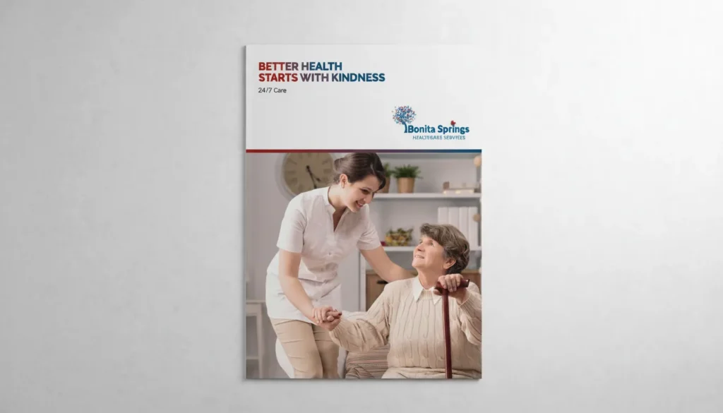
We began by defining a clear narrative for Bonita Springs, one that placed compassion, continuity and trust at the center of everything.

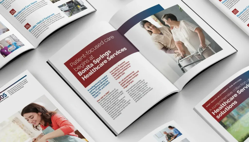
From there, we led the development of a structured messaging framework that could work across all service lines while remaining flexible enough to speak to different audiences, families, patients and healthcare partners.

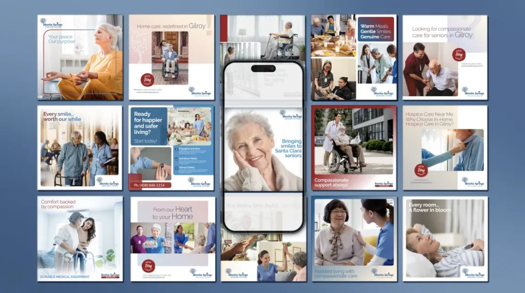
The visual language followed the same principle. Clean, calm and reassuring.

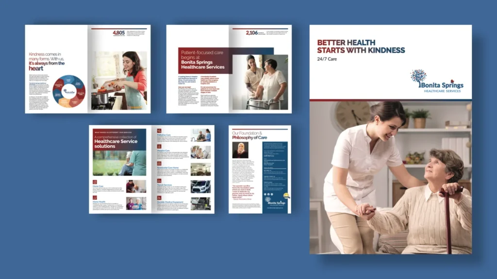
Every touchpoint was reconsidered.
Corporate profile
Service brochures
Print and editorial material
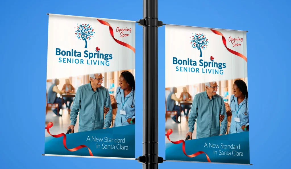
On-ground collateral
Social media content and design
Facilities branding

The goal was to make things look better, feel aligned, intentional and dependable.

Oswald is dependable, sharp and consistently solution-oriented, bringing clarity, strong ideas and thoughtful creative solutions you can trust every time.

Dr. Syeda Omer
CEO | Bonita Springs Healthcare Services

THE WORK

The Bonita Springs Healthcare Brochure was the starting point.

It became the foundation for the brand’s communication system, setting the tone for how services are presented, how messaging flows, and how information is structured for clarity and ease.

From there, the system extended across a wide range of collateral, ensuring consistency across formats while allowing each service to retain its individuality within the larger brand.

The work was designed to do one thing well:
Make it easier for people to understand, trust, and choose Bonita Springs.

THE DELIVERY

A unified brand language across all key touchpoints. Clear, structured messaging that reflects the full continuum of care. Collateral that feels calm, confident, and easy to engage with.

More importantly, the work helped establish a stronger sense of trust within the organization, allowing the brand to communicate with greater clarity and assurance moving forward.

PREVIOUS
MCB Bringing energy and clarity to corporate reporting within one of the world's most disciplined brand systems.
NEXT
SHELL Bringing energy and clarity to corporate reporting within one of the world's most disciplined brand systems.